In what ways does your media product use, develop or challenge forms and conventions of real media products?
Before starting our project I didn’t know a great deal about Film Noir. I had heard of it before and knew it was a black and white film but I didn’t know anything about the conventions of film noir. We started the topic by talking about the history of film noir. Film Noir started in the 1930’s and remained around until the early 1960’s. It originated in France and the name Film Noir actually stands for ‘Black Film’. This is because one of the main conventions is the dark, shadowy outlook. The film genre takes detective and crime noir as well as many gangster films. Film noir has recently moved into more modern films. These would include crime noir, “The Big Heat”, detective noir “L.A Confidential” and “Double Indemnity”, romance noir “The Big Sleep” and Neo Noir “Brick”. After researching some of these films we then watched, analysed and wrote feedback and reviews on them. We used this table to help us pick up some of the typical conventions of film noir. Written down the left hand side of the table is the most common conventions of a film noir, along the top is the films we watched and the green blocks show which film used what convention. After completing our film I then added our film to the table and highlight the conventions we had used, to compare to professional films.
The Film Noir era was between the 1930’s to 9060’s so when making our film we had to take into consideration the differences between then and present day. One of the main ones we picked up on was the clothing. All of our costumes had to represent the ordinary clothing that would have been worn in the 1950’s. We did some research and our costume on what we found. Loose box jackets over full skirts, or again in deeply bloused tops over circular skirts, long fur coats, and for the men suit, tie and a trilby hat. I think we managed to get costumes that fit in well with the given era. Although our costumes where in keeping with the time period, they weren’t 100% true to film noir. In film noir s the stereotypical femme fatale would be wearing red or white, in ours we decided that blue was a more suited colour for our female characters because they both played the femme fatale but that was the dramatic twist in our plot so we chose to play with that convention and make it a bit more unique to our play.
One of the main conventions of film noir is black and white film. Modern day noirs are known as neo noirs and are often in colour with modern conventions such as clothing, dialogue and props. We decided to stick to the original black and white film because we were making a film in the time era of the 1950’s. We also felt that once edited the film looked much better in black and white and blemishes to the film didn’t matter as much because it made it seem old fashioned.
Lighting is a big part of film noirs and it was very important we captured the same effect in our film. We often had to time our filming around the time of the day and the weather; this was because we often used a natural source of lighting when filming rather than artificial. This was due to personal preference. Two examples where our lighting worked really well is the Venetian blind scene and scene when the camera tracks Clark walking to Nancy’s front door. I picked these two moments in particular because they are key moments as show single source lighting and shadows.
How effective is the combination of your main product and ancillary texts?
When making our film we had to take into consideration all the conventions of a typical film noir. Therefore I also had to make sure these conventions carried on in my poster and review page. In order to connect my poster to my film I made sure that the colours I used where blacks, whites and greys-linking in nicely with the look of the film. I wanted to include a picture off all of the characters in our film, but unlike a normal poster with the femme fatale being the main part of the frame and the males smaller in the background I wanted to make sure my poster didn’t give anything away about my film and the status of the each character. The strong eye contact in the pictures of the characters makes the poster more engaging and draws a connection between the viewer and the characters. The strong eye contact in the pictures of the characters makes the poster more engaging and draws a connection between the viewer and the characters. The front on view of a gun is very symbolic for the ending of our film. However instead of have a silhouette of a gun or a picture I felt having a front on picture could have made it more unclear and make the audience think, which is what we wanted to achieve in our film as well.
The use of the typewriter font on both my poster and my review, link in nicely with Clark’s Newspaper Company. Typewriters were very common in the 1950’s and often used for letter writing etc. so as well as linking in with the film it also links in well with the time period. The use of the old fashion countdown clock also resembles the time era as it was often used in films and TV programmes during the 1950’s. The picture for my review page shows that the women have more dominance over Clark, giving a little more away about the story line, but I think this works well with the review because the audience need to be able to read into the connotation of the pictures to make them want to see the film.
What have you learned from your audience feedback? On Thursday 22nd March we had our official viewing of the class’ film noirs. Everyone was given a post –it note on which they had to write some constructive feedback on. Our audience members consisted of well knowledge media students who know all of the conventions of film noir to other students who hadn’t heard anything about it before. However when showing our film we suffered a few technical difficulties and due to this it made the film very dark and jumpy.After receiving our feedback we took it upon ourselves to adjust and add thing about film. Adding text at the beginning and clips throughout our film made it easier for our audience to distinguish the passing time in our film. We also added in the title of the film and the edit credit. One final adjustment we made when filming was the end scene. We made some minor chances to the final scene because of the set space, if we had stuck with our original idea the set would have been too small ad it would have been impossible to capture a good full length shot of the action. I feel keeping the end as a cliff hanger helped with the suspense of the film and it proved to work with our feedback. As well as class feedback I also made an audience member watch our final film and produced a small evaluation video on his feedback.
How did you use media technologies in the construction and research, planning and evaluation stages?
Technology used for the making of our film:
1)Microsoft Word
2)Adobe Photoshop CS5
3)Windows Movie Maker
4)Final Cut Express
5)Photography Studio – Lighting
6)Canon Digital SLR
These are all of the different types of technology we used in the making of our film, Blackmail.
Microsoft Word – Microsoft Word was the first technical program we used towards making this film. It was used to design our screen play and then edit it accordingly. To produce our screen play we needed to know how to use different font and sizes, spacing and paragraphing and highlight. This was a vital stage in our planning and the outcome of this screenplay relied on the production of our film. The screenplay included actions, camera angles, mise-en-scene, sound, dialogue, setting, and editing. Microsoft word was also very important for the making of my poster and review page. Despite the majority of photo editing happening in Adobe Photoshop I had to link all the pieces together in a word document. Using Microsoft Word 2010 allowed working on my poster in more detail once I had linked it all together and focus on the finer details such as blurred edges and a glow effect around text.
Adobe Photoshop CS5/Canon Digital SLR/Photography Studio – This was really helpful for the editing stages of my ancillary projects. My pictures had to be merged and faded into one another to create the effect I needed for my poster and this helped me to the job. Not only did we use Photoshop for our individual projects but we also used it in the making of some of our props. The pictures of Nancy and newspaper drafts you see on Clark’s desk are all made in Photoshop, after been taken on a Canon Digital SLR camera. We need to edit all the pictures we used for props to make them appear older and as if they had been taken by an older camera so we used an effect on Photoshop called an ‘Action’ this then allowed us to make the picture vintage and black and white. The SLR camera was often used throughout the filming process. We used it to take still shots during filming and often captured a moment of action that we could use for a poster. We also used it to take pictures of our set, props and costumes. This was very important because we often filmed in stages and would need to remember where everything was placed so the next time we came back to film we could re arrange everything in exactly the same place. The camera also played a big part in our photo shoot after filming for our ancillary projects, but not only did we have the functions of the camera to worry about we also need to know how to use the professional lighting system in our school studio to allow us to create deep shadows and a single source, low key lighting on each of our faces in the pictures.
Windows Movie Maker/Final Cut Express- These are the two software’s we used to edit our film clips we had produced. Final Cut Express was used for our final film because it is very new, profession software, which allows you to create many different effects on one video as well as combining and merging many different video clips together. We did all of our editing in Final Cut Express. Here are some of the vital stages of our editing process. If we wanted to make a clip black and white we would select the clip we wanted or in our case if it was the whole movie shift then select the first and last clip. Then by selected effect, video filters, colour correction and then colour corrector. This then enabled us to adjust the level of black and white in our clip. This is a screen shot of the black and white tool. We used this to make the clips in our film into black and white. We used black and white because it is a main convention of film noir and we think it worked well with our clips. To make our clips black and white we dragged the saturation of the clip all the way down to 0. This meant that no colour would be visible in this clip. If the clip was particularly bright or we wanted to make it more shadowed and eerie, we made the contrast higher at this stage which would enhance any shaded areas, making the clip more 'black and white' rather than grey. When editing our film in to black and white we edited each clip individually because we found that each clip had different levels of brightness and if we had used the same level of black and white on all of our clip the brightness and contrast would have changed throughout the clips. When we came to edit our clips we had noticed that we had filmed extra either side of the main action. We needed to get rid of this extra footage in order for the clips to link smoothly and make sense. To do this we selected the clip we needed to cut, then clicking the cut tool on the tool bar reselecting the part the start and the end of the clip we wanted to delete. Changing the curser back to the ordinary mouse again, selecting the section to be deleted and then pressing the delete button on the key board. This proved really helpful in the making of our film and helped us distinguish the part in which we need to add transitions. When it came to smaller video such as character interviews or audience feedback I decided the best way to edit my film together would be to use Windows Movie Maker, it has a basic format which allows you to combine video clips with transitions to link them into a movie. I found this very useful as I didn’t have Final Cut Express on my home laptop.
The second task set after making our film was to produce a double page spread film review on our film. Throughout our A2 media class we have watched many classic film noirs such as Double Indemnity, Brick, L.A Confidential and The Big Sleep. When then did a lot of research into film reviews on these films and then finished by writing our own. After doing some research into magazine reviews I though analysing my some actual film reviews would be helpful before making my own. These are two reviews I have taken examples from to make my own. I was inspired by the first review because it took up two pages of the magazine the colours where all in co-ordinated and I think linked in well with the genre of the film. Therefore I decided to make my film review page in black and white. This then would link in nicely with one of the key conventions of film noir. I also really liked how they used a clip from the film an ‘action shot’ as the background for the review. I tried using some of the pictures below for my background but I think the final picture I did use worked well and doesn’t give too much away about the film.
Combining the two reviews and different techniques they both used really helped me create a suitable review for our film. Including more information to the review was a good choice because I feel I filled up more space. Instead of making the text white I changed the colour to an off white in order to create a more 1950’s effect. The colours of newspapers and screens wouldn’t have been refined black and white and I wanted this to show through my review. One thing I did include in my review that these two didn’t was smaller screen grabs and pictures from within the film. I had noticed that some of the reviews in the video below I had analysed included smaller pictures which I felt made the review more interesting, making me want to see it more because I wanted to find out what was happening in that specific moment.
Included in the number at the top of the page was something a lot of the present day reviews do. This shows to the reader the magazines film priority and which film they would mark up as their ‘number one’ film to see. I decided to incorporate this into my review but add my own unique twist by making my countdown like an old fashioned countdown clock. This would fit in well with the time period the film was set in and make my review more interesting and eye catching.
Overall I am very happy with how my poster turned out I made sure I incorporated all the typical conventions of a poster. E.g. A picture, production company label, Actors in small print. I think the picture represents each character really well and if you hadn't watch the film it would intrigue you as to who is the dominante character, as not much is reveled on the poster; yet all of the characters look guilty of something.
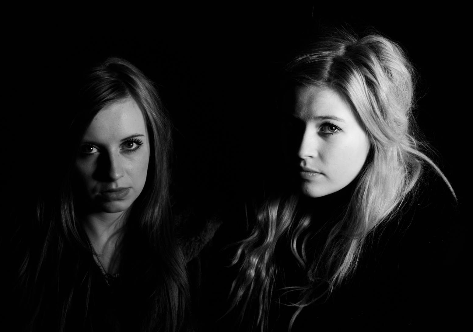
After making our film we got given two additional tasks of making a movie poster for our film and a double page magazine film review. This is the process of stage I went through to make my movie poster. Firstly we did a photo shoot in the school studio of each character then combined pictures. Film Noir is known for its dark shadows and low key lighting so this was a crucial stage of the shoot
To the left are the contact sheets I made after the photo shoot. I had to go through all of these photos individually and select the one’s that would be suitable to use for a poster.
Above shows different stage of the photo shoot. Once I had selected my pictures I imported them into Photoshop CS5. These are the three picture i chose to use. I merged them together to make one picture by dragging and dropping one picture over another. Then my changing the opacity I could control how dominante each was in the picture.
Once I had made the picture and exported it, I inserted it into a word document. Here I added the text and any final effects. I made the words ‘Blackmail’ blurred like smoke because I felt it gave the effect of a smoking gun after it had been shot which tied in nicely with the film. The other text was in a simple typewriter font which linked in well with Clark’s newspaper business and the newspapers.
This is some of the Audience feedback we got after the first showing of our film. We are very happy with the feedback as they audience have picked up on all the conventions we have used, they have also noticed all the hard work and preparation that went into the film, e.g costumes, props, music e.t.c


 The Film Noir era was between the 1930’s to 9060’s so when making our film we had to take into consideration the differences between then and present day. One of the main ones we picked up on was the clothing. All of our costumes had to represent the ordinary clothing that would have been worn in the 1950’s. We did some research and our costume on what we found. Loose box jackets over full skirts, or again in deeply bloused tops over circular skirts, long fur coats, and for the men suit, tie and a trilby hat. I think we managed to get costumes that fit in well with the given era. Although our costumes where in keeping with the time period, they weren’t 100% true to film noir. In film noir s the stereotypical femme fatale would be wearing red or white, in ours we decided that blue was a more suited colour for our female characters because they both played the femme fatale but that was the dramatic twist in our plot so we chose to play with that convention and make it a bit more unique to our play.
 Lighting is a big part of film noirs and it was very important we captured the same effect in our film. We often had to time our filming around the time of the day and the weather; this was because we often used a natural source of lighting when filming rather than artificial. This was due to personal preference. Two examples where our lighting worked really well is the Venetian blind scene and scene when the camera tracks Clark walking to Nancy’s front door. I picked these two moments in particular because they are key moments as show single source lighting and shadows.

 Microsoft Word – Microsoft Word was the first technical program we used towards making this film. It was used to design our screen play and then edit it accordingly. To produce our screen play we needed to know how to use different font and sizes, spacing and paragraphing and highlight. This was a vital stage in our planning and the outcome of this screenplay relied on the production of our film. The screenplay included actions, camera angles, mise-en-scene, sound, dialogue, setting, and editing. Microsoft word was also very important for the making of my poster and review page. Despite the majority of photo editing happening in Adobe Photoshop I had to link all the pieces together in a word document. Using Microsoft Word 2010 allowed working on my poster in more detail once I had linked it all together and focus on the finer details such as blurred edges and a glow effect around text.

 The second task set after making our film was to produce a double page spread film review on our film. Throughout our A2 media class we have watched many classic film noirs such as Double Indemnity, Brick, L.A Confidential and The Big Sleep. When then did a lot of research into film reviews on these films and then finished by writing our own. After doing some research into magazine reviews I though analysing my some actual film reviews would be helpful before making my own. These are two reviews I have taken examples from to make my own. I was inspired by the first review because it took up two pages of the magazine the colours where all in co-ordinated and I think linked in well with the genre of the film. Therefore I decided to make my film review page in black and white. This then would link in nicely with one of the key conventions of film noir. I also really liked how they used a clip from the film an ‘action shot’ as the background for the review. I tried using some of the pictures below for my background but I think the final picture I did use worked well and doesn’t give too much away about the film.
 Included in the number at the top of the page was something a lot of the present day reviews do. This shows to the reader the magazines film priority and which film they would mark up as their ‘number one’ film to see. I decided to incorporate this into my review but add my own unique twist by making my countdown like an old fashioned countdown clock. This would fit in well with the time period the film was set in and make my review more interesting and eye catching.


 Above shows different stage of the photo shoot. Once I had selected my pictures I imported them into Photoshop CS5. These are the three picture i chose to use. I merged them together to make one picture by dragging and dropping one picture over another. Then my changing the opacity I could control how dominante each was in the picture.