

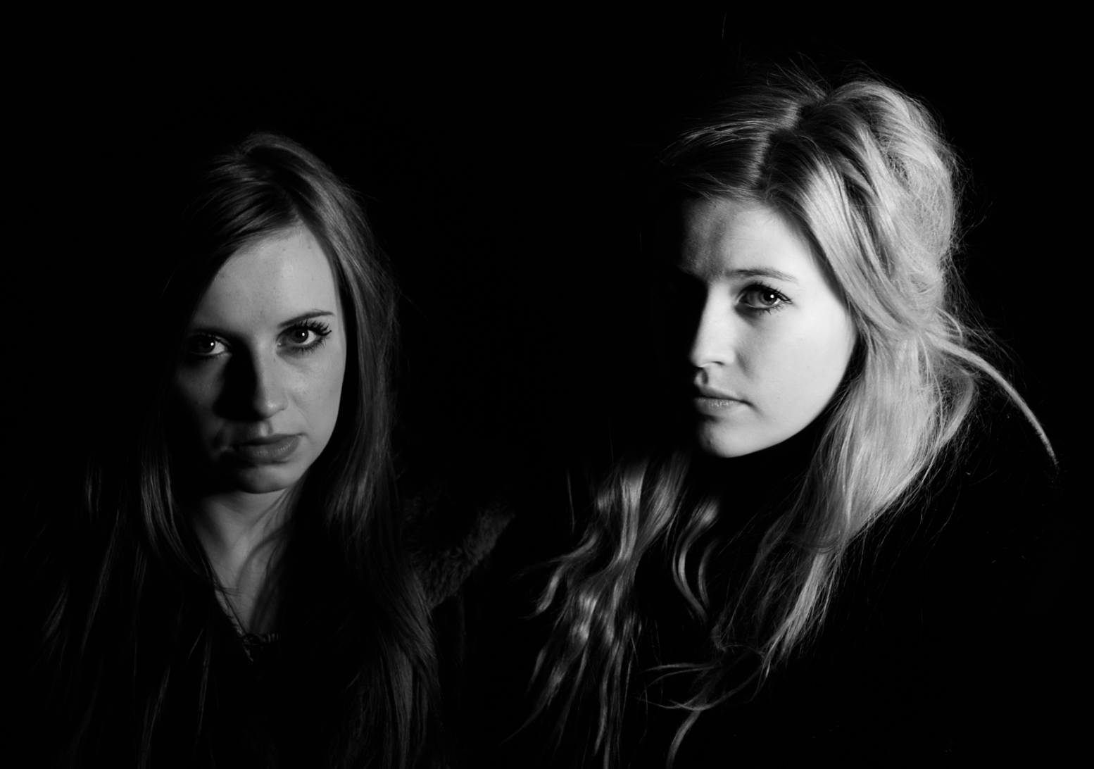
 The second task set after making our film was to produce a double page spread film review on our film. Throughout our A2 media class we have watched many classic film noirs such as Double Indemnity, Brick, L.A Confidential and The Big Sleep. When then did a lot of research into film reviews on these films and then finished by writing our own. After doing some research into magazine reviews I though analysing my some actual film reviews would be helpful before making my own. These are two reviews I have taken examples from to make my own. I was inspired by the first review because it took up two pages of the magazine the colours where all in co-ordinated and I think linked in well with the genre of the film. Therefore I decided to make my film review page in black and white. This then would link in nicely with one of the key conventions of film noir. I also really liked how they used a clip from the film an ‘action shot’ as the background for the review. I tried using some of the pictures below for my background but I think the final picture I did use worked well and doesn’t give too much away about the film.
 Combining the two reviews and different techniques they both used really helped me create a suitable review for our film. Including more information to the review was a good choice because I feel I filled up more space. Instead of making the text white I changed the colour to an off white in order to create a more 1950’s effect. The colours of newspapers and screens wouldn’t have been refined black and white and I wanted this to show through my review. One thing I did include in my review that these two didn’t was smaller screen grabs and pictures from within the film. I had noticed that some of the reviews in the video below I had analysed included smaller pictures which I felt made the review more interesting, making me want to see it more because I wanted to find out what was happening in that specific moment.

 Included in the number at the top of the page was something a lot of the present day reviews do. This shows to the reader the magazines film priority and which film they would mark up as their ‘number one’ film to see. I decided to incorporate this into my review but add my own unique twist by making my countdown like an old fashioned countdown clock. This would fit in well with the time period the film was set in and make my review more interesting and eye catching.
No comments:
Post a Comment