VIDEO

MAGAZINE REVIEW

POSTER

 The Film Noir era was between the 1930’s to 9060’s so when making our film we had to take into consideration the differences between then and present day. One of the main ones we picked up on was the clothing. All of our costumes had to represent the ordinary clothing that would have been worn in the 1950’s. We did some research and our costume on what we found. Loose box jackets over full skirts, or again in deeply bloused tops over circular skirts, long fur coats, and for the men suit, tie and a trilby hat. I think we managed to get costumes that fit in well with the given era. Although our costumes where in keeping with the time period, they weren’t 100% true to film noir. In film noir s the stereotypical femme fatale would be wearing red or white, in ours we decided that blue was a more suited colour for our female characters because they both played the femme fatale but that was the dramatic twist in our plot so we chose to play with that convention and make it a bit more unique to our play.
 Lighting is a big part of film noirs and it was very important we captured the same effect in our film. We often had to time our filming around the time of the day and the weather; this was because we often used a natural source of lighting when filming rather than artificial. This was due to personal preference. Two examples where our lighting worked really well is the Venetian blind scene and scene when the camera tracks Clark walking to Nancy’s front door. I picked these two moments in particular because they are key moments as show single source lighting and shadows.

 Microsoft Word – Microsoft Word was the first technical program we used towards making this film. It was used to design our screen play and then edit it accordingly. To produce our screen play we needed to know how to use different font and sizes, spacing and paragraphing and highlight. This was a vital stage in our planning and the outcome of this screenplay relied on the production of our film. The screenplay included actions, camera angles, mise-en-scene, sound, dialogue, setting, and editing. Microsoft word was also very important for the making of my poster and review page. Despite the majority of photo editing happening in Adobe Photoshop I had to link all the pieces together in a word document. Using Microsoft Word 2010 allowed working on my poster in more detail once I had linked it all together and focus on the finer details such as blurred edges and a glow effect around text.

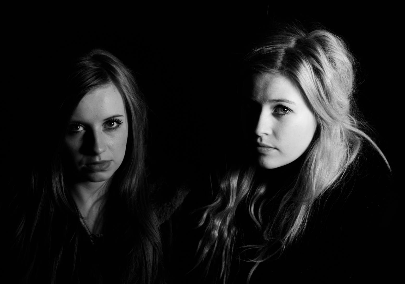
 The second task set after making our film was to produce a double page spread film review on our film. Throughout our A2 media class we have watched many classic film noirs such as Double Indemnity, Brick, L.A Confidential and The Big Sleep. When then did a lot of research into film reviews on these films and then finished by writing our own. After doing some research into magazine reviews I though analysing my some actual film reviews would be helpful before making my own. These are two reviews I have taken examples from to make my own. I was inspired by the first review because it took up two pages of the magazine the colours where all in co-ordinated and I think linked in well with the genre of the film. Therefore I decided to make my film review page in black and white. This then would link in nicely with one of the key conventions of film noir. I also really liked how they used a clip from the film an ‘action shot’ as the background for the review. I tried using some of the pictures below for my background but I think the final picture I did use worked well and doesn’t give too much away about the film.
 Included in the number at the top of the page was something a lot of the present day reviews do. This shows to the reader the magazines film priority and which film they would mark up as their ‘number one’ film to see. I decided to incorporate this into my review but add my own unique twist by making my countdown like an old fashioned countdown clock. This would fit in well with the time period the film was set in and make my review more interesting and eye catching.


 Above shows different stage of the photo shoot. Once I had selected my pictures I imported them into Photoshop CS5. These are the three picture i chose to use. I merged them together to make one picture by dragging and dropping one picture over another. Then my changing the opacity I could control how dominante each was in the picture.

 We found it quite difficult coming up with a name for our production company. We wanted something that would be relavent to our film without it being too cheesy. We thought back to when we was making our story board and figured a good name for our production company would be ‘Stickman Productions’ as all of our initial ideas where produced by us in stickman form. When we came to make our production company sequence for our film we didn’t want to make it too technical or advance we wanted it to symbolise the more creative side to designing a film and decided the best way to show this would be by drawing; linking in with how a film is first started.


 Close Up
 Mid Shot
  Making our own sounds proved very difficult and didn’t sound profession so in order to get sounds on our film we decided to download them from a website. Before downloading any sounds we emailed the owner of the sound company we would be using to ask their permission. After doing this we were very happy with how the sounds worked with our piece.

 When we came to edit our clips we had noticed that we had filmed extra either side of the main action. We needed to get rid of this extra footage in order for the clips to link smoothly and make sense. To do this we selected the clip we needed to cut, then clicking the cut tool on the tool bar reselecting the part the start and the end of the clip we wanted to delete. Changing the curser back to the ordinary mouse again, selecting the section to be deleted and then pressing the delete button on the key board. This proved really helpful in the making of our film and helped us distinguish the part in which we need to add transitions.
  Finally the last thing we did do our clips to make them seem more old fashioned and in keeping with the theme of film noir was add the effect 'Vignette'. This blurred the edges of the clip. We decided that although the black and white effect looked good and worked well fitting in with the conventions of film noir. Our film needed something more than just black and white. We decided to add another effect to our clip. 'Video Filters' allowed us to experiment with different effects. Then we chose one under the section 'Stylize and the filter right at the end called 'Vignette'. As you can see it gives the image a darker edge and looks better.
 Final Cut Express 4.0 is one of the lastest video editing sofeware's available from Apple, it's one of the most advanced pieces of software and with it we can stunning videos. The standard layout consists of the Browser, Timeline, Viewer and Canvas. The browser is where unedited content is stored, when a file is imported it will appear in the browser as a small preview with the clip number and length underneath. Double clicking this clip will allow you to edit it.


